Organizations are recognizing the importance of data in this era of digital transformation. And it’s just as important to determine how data is visualized for quick interpretation. In some cases, datasets aren’t so clear-cut that a bar chart or pie chart is enough to demonstrate the numerical values and reflect what they mean. That’s why some business users turn to logarithmic charts and scales to better address intervals in data and paint a better picture for the sake of insight and analytics.
Understanding Logarithmic Charts

A logarithmic chart uses a logarithmic scale rather than a linear value like a bar chart. With logarithm scales or “log scales,” the end value could be the same as the linear value, while the spaces between the values are different. This helps to display data over a large range of values in a compact form for greater visual ease. Logarithms are non-linear, and they’re another way of writing exponential equations. This allows the separation of the exponent on one side of an equation so that it’s easy to assess the rate of change based on exponential growth.
Logarithmic scales are used in circumstances where not everything across the bulk of the data is equal. Think of this as a thermometer. You won’t notice a five-degree temperature change on an average spring day, but you’ll notice it on a blazing hot summer day. These log scales are more common than you think. For example, the Richter scale measures the seismic shifts that lead to earthquakes. Displaying this on a linear scale doesn’t deliver the same demonstration of exponential functions that a logarithmic plot shows in amplitude.
When to Use Log Scales and Charts

A logarithmic scale is used in two different circumstances: when data covers a large range of values or when data contains exponential laws. A logarithmic chart is ideal in two scenarios. In one use case, there could be a skewness toward large values in datasets or points that are much smaller or larger than the remainder of the data through those input quantities. This is useful in the sales realm to determine profits for a chain retailer. Log charts and scales even help pinpoint the numbers for every location, which can be more useful in comparison to a linear chart that can only emphasize top sellers across the United States.
Logarithmic charts are also used to show a percentage shift or factors of multiplication. For example, if that chain retailer sold a new product and doubled product sales each year, a traditional bar chart would only show a sharp uptick. However, a logarithmic scale will show the doubling annually. The linear chart, which has become commonplace across businesses to just get some simplified visuals, only shows the number of products over time. A logarithmic chart shows the rate of change, providing a better assessment for decision-makers.
Examples of Logarithmic Charts

To make trends easier to see and display a wider range of data, there are a few chart types that work well with logarithmic scales. Bar charts don’t work well because they require visual length assessment. Meanwhile, a dot chart provides a far less cluttered visual. This clearly shows values across horizontal and vertical scales, unlike bar and column charts. A line chart is also common for log scales, clearly showing trend lines to emphasize the strength of logarithmic charts.
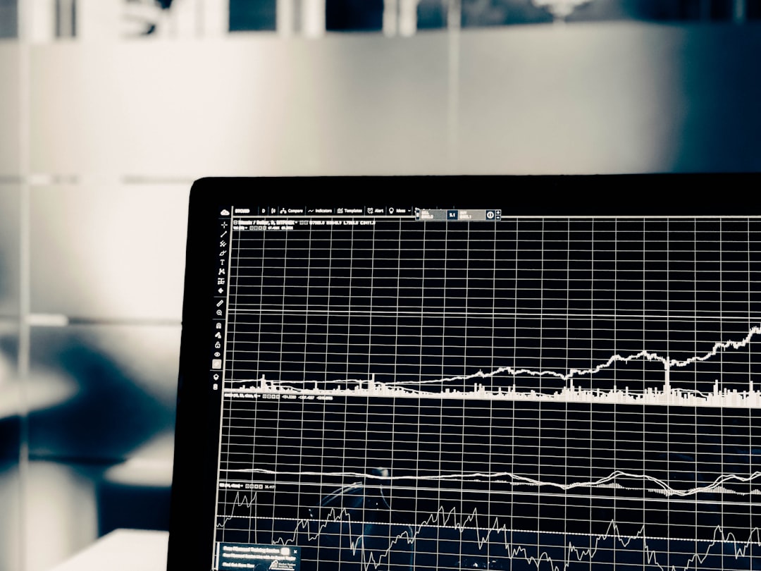
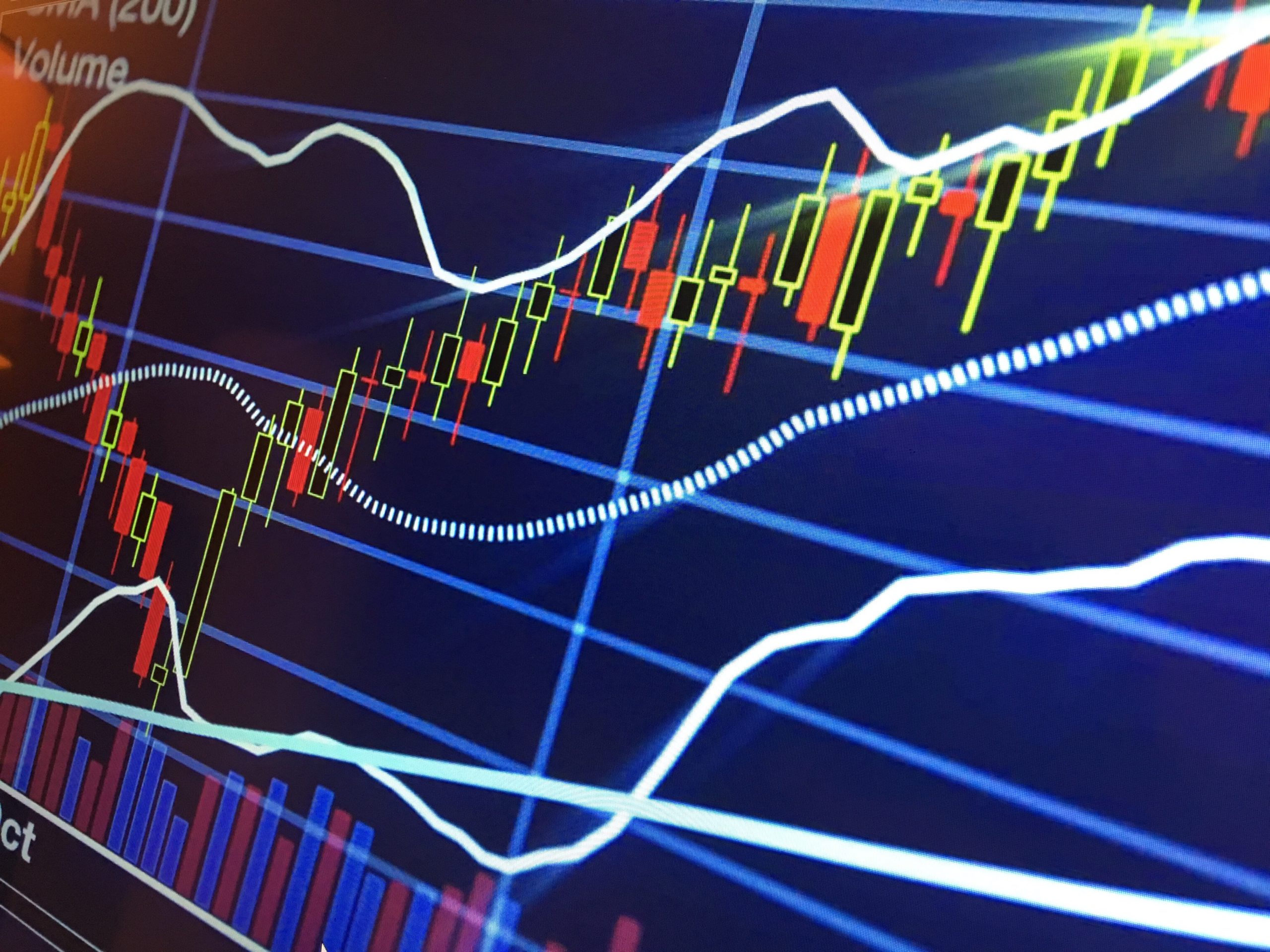
Specialized stock and share charts have become a tremendous asset to show trends and patterns, like rate of increase, in a logarithmic fashion that is easily understandable. This includes candlestick charts, Kagi charts, and Renko charts. These types of charts show a range of information from stock prices to general sentiment in customer service, converting datasets into remarkable insights that are a great part of any business arsenal for better business processes.


